Thoughts on the Clicks Keyboard

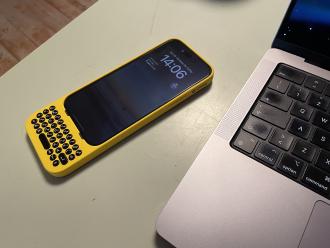
I pre-ordered a Clicks keyboard back when it was first unveiled to the world, in January 2024.
I developed a taste for hardware keyboards during my high-school years, having used a Nokia N900 , Palm Pre and Pre3 for general note-taking and communications.
While there are no glaring issues with the on-screen keyboard available on iOS devices1, I love the feeling of physically pressing down buttons and seeing characters pop up on the screen.
I’ve been using the Clicks keyboard religiously for the past two weeks, and I’m ready to some notes I took while using the it:
- There’s no easy way to access multitasking from the keyboard itself, even though
Command+hbrings you home – this is an iOS issue, since Clicks acts as a USB keyboard. - I couldn’t find a way to toggle auto-caps-lock at the beginning of a text field that enforced it – on the on-screen keyboard you could tap
Shiftto do that. - Arrow keys would be a nice addition, even as a secondary layer.
- Following from the previous point, there’s no way to select a slice of text since there’s no way to move the cursor around.
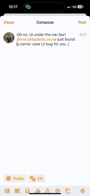
- Some apps assume the on-screen keyboard will be visible when inserting text: UI components might end up under the iOS navigation bar.

This bug is present in the Ivory Mastodon client. - MagSafe absence is a real letdown, I wished they went for a compatible version from the start – wireless charging still works, but MagSafe magnets aren’t strong enough to hold a power bank still.
- No lag when writing, it’s as if I was typing on my Palm Pre3 keyboard!
- iOS autocorrect makes up for writing mistakes while using Clicks, and contributes to the overall experience in a positive way.
- Making a call with speakerphone on results in enough echo on the receiving end that I had to stop using it.
- Would’ve been nice to have a Type-C connector on the Lightning version.
- Writing special characters like “+” or “%” requires popping up the on-screen keyboard – this is probably why they added a button that does just that alongside the microphone and
Tabkeys. - Clicks isn’t water resistant, so don’t bring it in the shower.
- Holding it “the right way” might be finicky for some, it took me about a week to start being proficient with.
- I wish keys were slanted a little, maybe with an extra row for numbers and special characters, like a Blackberry or a Treo.
- Life hack: remap the
Globekey toOptionin iOS settings, makes for a more computer-like experience and doesn’t loose you any real functionality in my opinion. - A companion app is needed, there’s no way to update the firmware running on Clicks – allowing users to add custom key bindings could also be a nice addition.
- Sometimes the phone stops responding to Clicks inputs or starts spamming a single key indefinitely, I have to remove and re-attach it to fix the issue.
- No way to call iOS native support for password managers, I have to rely on the on-screen keyboard to do that – in my opinion this is more an iOS shortcoming, since iPad can do that just fine when using an external keyboard.
- There is no way to understand if caps lock is enabled or not, adding a colored LED under the
Shiftkey will solve this issue – just like the one found on Mac keyboards. - The silicone used for the casing is very high quality, and the added structural support given by the rigid plastic inserts alongside most of the body makes Clicks feel strong.
- Makes the phone feel particularly big, albeit well-balanced – I can’t see myself using it on a Max iPhone.
Truth to be told sometimes I do find myself wondering if there’s a spot in today’s phones for a physical keyboard: its on-screen heir reached great levels of accuracy and speed.
Does Clicks makes for a better typing experience? I’d say seven times out of ten yes, I find myself wanting to type on it rather than on the iOS digital keyboard – for me that’s enough to keep using it for the foreseeable future.
As far as general usability, I love invoking Spotlight from within every app: I don’t run apps from the home screen anymore, I just type part of their name and then press Enter.
Having more screen real estate is also enjoyable, especially on “smaller” phones like my iPhone 14 Pro.
Overall it’s a nice piece of kit for those who wish Palm was still around in 2024, with their wacky designs and alternative takes on operating system UIs.
Not counting a few bugs introduced in iOS 17… ↩︎